Landing Page Design That Converts: Layout, Copy, and Visual Hierarchy
Landing pages can make or break your digital marketing in a matter of seconds. They are single-purpose pages with a single job: turning visitors into leads. For this reason, you need a smart layout, compelling copy that nudges people forward, and clear visual cues that point to the next step.
A good landing should look good and deliver results.
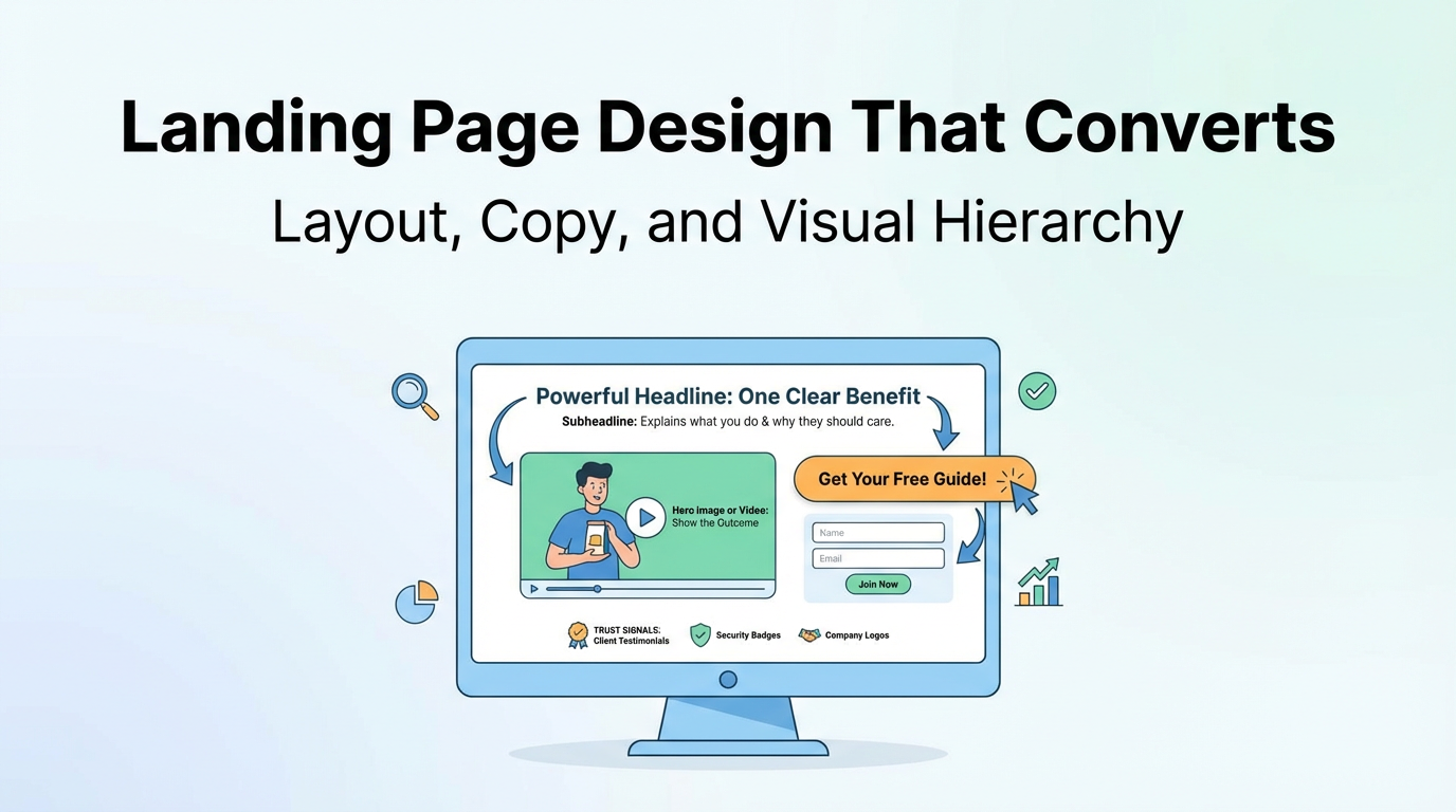
Start with the “Above the Fold” Trio
Your page’s top section needs three key elements working together:
1. It should have a powerful headline that stops the scroll fast. It gives you one clear benefit. Or it highlights one problem you want gone. Just keep it plain. For example, “Get More Customers in 30 Days” beats “Innovative Solution for Business Growth Optimization.”
2. A good subheadline fills in the gap that the headlines missed by explaining what you do. It also explains why the reader should care. Just keep it quick to read. Example, “Our step-by-step system helps local businesses attract high-quality leads without expensive ads.”
3. Your hero image or video should show the outcome that people want. It should not be a random stock photo. When using video, you can keep it under 60 seconds and focus on your offer. People decide if they care about your page in about 3 seconds.
Layout That Guides the Eye
Clean design always beats cluttered pages. Use spacing intentionally to highlight important elements.
Keep your page elements in an order that makes sense and keeps attention. You should lead with your headline, follow with proof or benefits, and then show your call-to-action button. Finally, put your form at the end.
You should remove anything that does not help your main goal. Additional navigation menus, social media buttons, and random links can divert users from your offer.
Also, make your CTA button easy to spot. If your page runs long, add another button later. It will help people who want more context before making a decision.
Copy That Converts
Begin with your visitor’s gain, then back those claims with details to reinforce your sentence.
Break your text into small chunks. Small paragraphs and quick sentences help fast readers scan your page.
Keep your sections narrowed down to:
- What you’re offering
- Who benefits from it
- What problem does it solve
- What happens immediately after they join?
Empty claims are unhelpful. Instead of saying, “results are good,” say, “3x more leads in 30 days.” Providing details is better than being vague.
Visual Hierarchy: Make Important Parts Pop
Your audience’s focus can be directed through the use of size, space, and page position. The page should read like a guided tour. First, a headline. Next, a key line. Then a button.
Your CTA button should be the most visually dominant element. Use a contrasting color to make sure it’s the first thing people see.
Use headings and subheads to make things easier to read. They are designed to help skimmers move through text quickly. A person should be able to read only the headings and understand the gist of your content.
The Conversion Engine: CTA + Form + Trust Signals
Your call to action should be as clear as possible. “Get Your Free Guide” is a far better option than “Submit” or “Click Here.” Clearly state what the next action is and keep it straightforward.
Having a single CTA is best. Multiple distractions can reduce conversion rates.
For lead forms, ask for only what you truly need. A single extra field can reduce the number of sign-ups. Removing one field can increase conversions by 11%, according to HubSpot.
You should also add trust signals near your form or CTA. For example, Client testimonials, company logos, and security badges help dispel doubts at the moment of decision.