
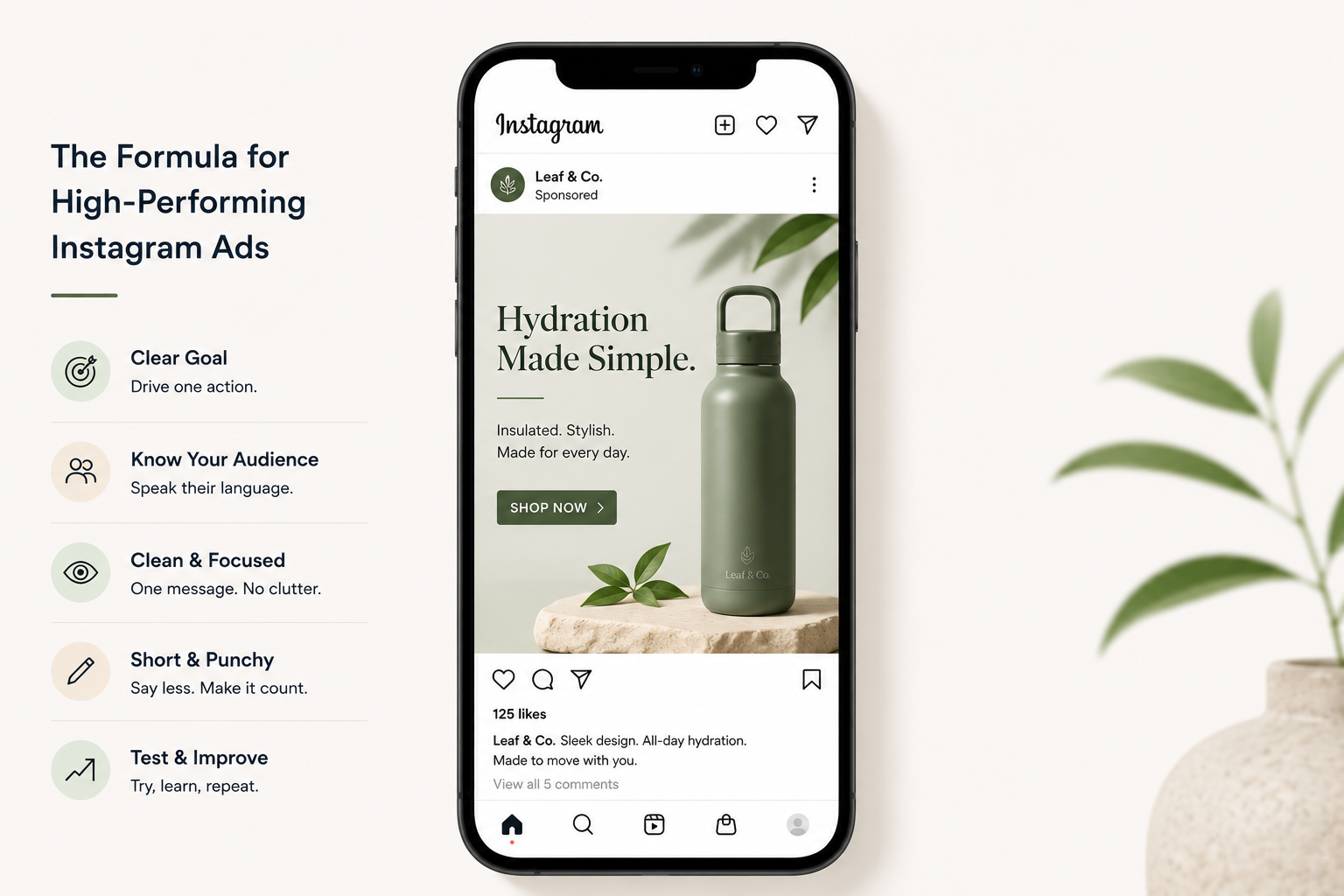
The Anatomy of a High-Performing Instagram Ad (Design Breakdown)
Users can scroll through Instagram in less than a second. Your ad needs to convince users to stop scrolling. If your ad design is poor, nobody reads your text, clicks your ad, or completes your sale.
Let’s take a look at what makes an Instagram ad successful.
Start With a Clear Goal
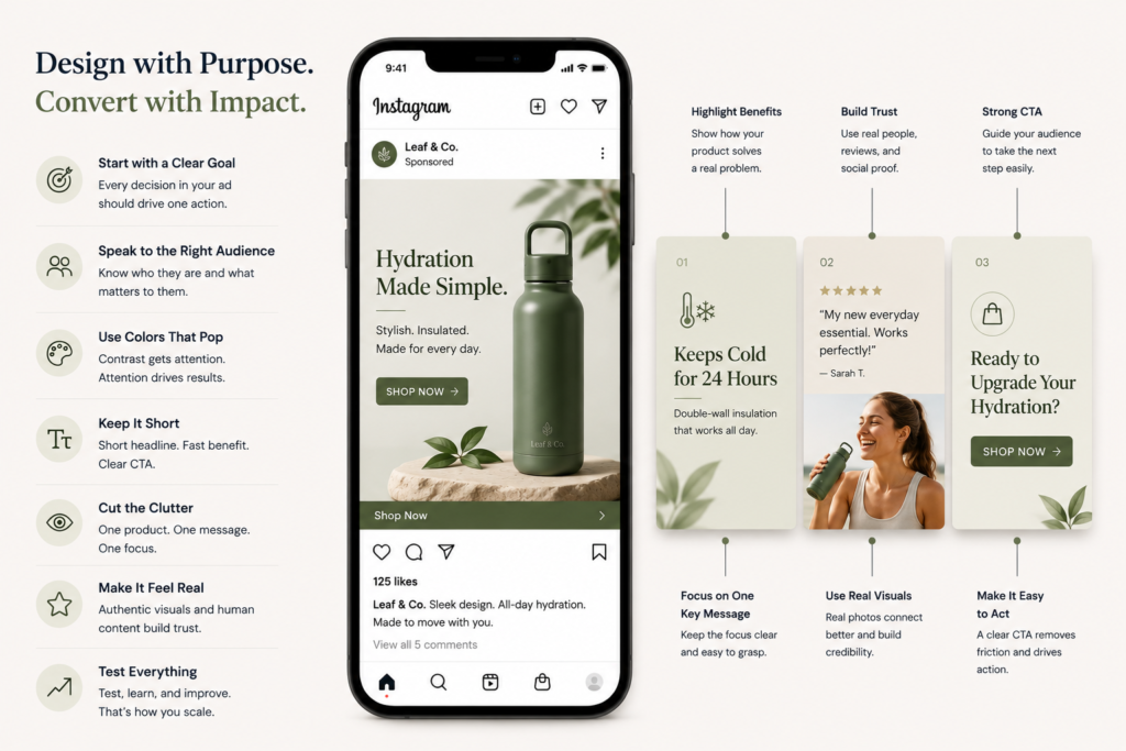
Understand what action you want your ad viewers to take before you begin designing. Do you want them to purchase, subscribe, or visit your website? Every element in your ad should support your objective, from your visual elements to your text, and also to your call to action.
Ad viewers won’t take action without a clear objective. Without an objective, you are just posting pictures and pretty pictures, which don’t pay the bills.
Know Who You’re Talking To
Instagram offers several resources to help you reach your ideal audience. Paint a clear picture of your ideal purchaser. It should include their age, interests, and pain points. Your ad should be designed with your ideal purchaser in mind. Your ad will be ineffective if it is presented to the incorrect audience.
Colors That Pop
This is one of the easiest Instagram ad design tips to use right away. Add one or two colors that contrast strongly. They pull the eye in and hold attention for a split second longer. That split second is everything on a busy feed.
Bright colors on a neutral background. Dark text on a light image. Simple moves. Big results.
Keep the Text Short
Nobody reads a wall of text on Instagram. Keep your Instagram ad copy brief and punchy. A short headline. A fast benefit. A clear call-to-action. That’s truly all you need.
Meta actually prefers ads with less than 20% text on the image. And honestly, less text looks cleaner too.
Cut the Clutter
Too much going on in one image kills Instagram ad-creative. One product. One message. One focus. That’s the sweet spot. When you try to show everything at once, people end up seeing nothing.
Use white space generously. It guides the eye right where you want it to go. It also looks clean and put-together. Bonus: it signals quality to people scrolling past.
Make It Feel Real
People can smell a fake ad from a mile away. The overly polished stock photo. The stiff tagline. The robotic tone. It all pushes people away.
Authentic content connects. Show real people using your product. Share what goes on behind the scenes. Add a bit of humor if it fits your brand. Be human about it. Instagram ads that actually convert don’t look like ads. They look like content.
Use Your Brand Colors and Logo
Add your brand colors to the design. It builds familiarity over time. Someone might not click today, but they’ll remember you next week. Drop your logo in too, especially for Stories, where your profile picture is easy to miss.
Test Everything
One image is never the full answer. Create two or three versions of the same ad with different visuals. Run them together. See what your audience actually responds to. The data tells you what no amount of guessing ever will.
Tools like Canva, Snappa, and Adobe Spark make it fast and easy to build multiple ad versions. You don’t need advanced Photoshop skills to create strong Instagram ad visuals.
Match Your Design to the Format
Instagram has different layouts for different ads. Here are some in case you need guidance:
- Ads meant for the Instagram feed should use a square format
- The vertical ads should be used in Stories
- Carousels will be better for ads that contain multiple images
Choose the correct layout for the ad to achieve your goal.
Final Thought
Great Instagram ad design starts with a goal and builds from there. Keep it clean, keep it real, and keep testing. You’ll find what works for your audience faster than you’d expect.
The goal is the most important aspect of an ad. Design and layout will go a long way. But you will also need to have inspiration and an understanding of your target audience. If you follow all the above, you will achieve success with your ad much faster than expected.