
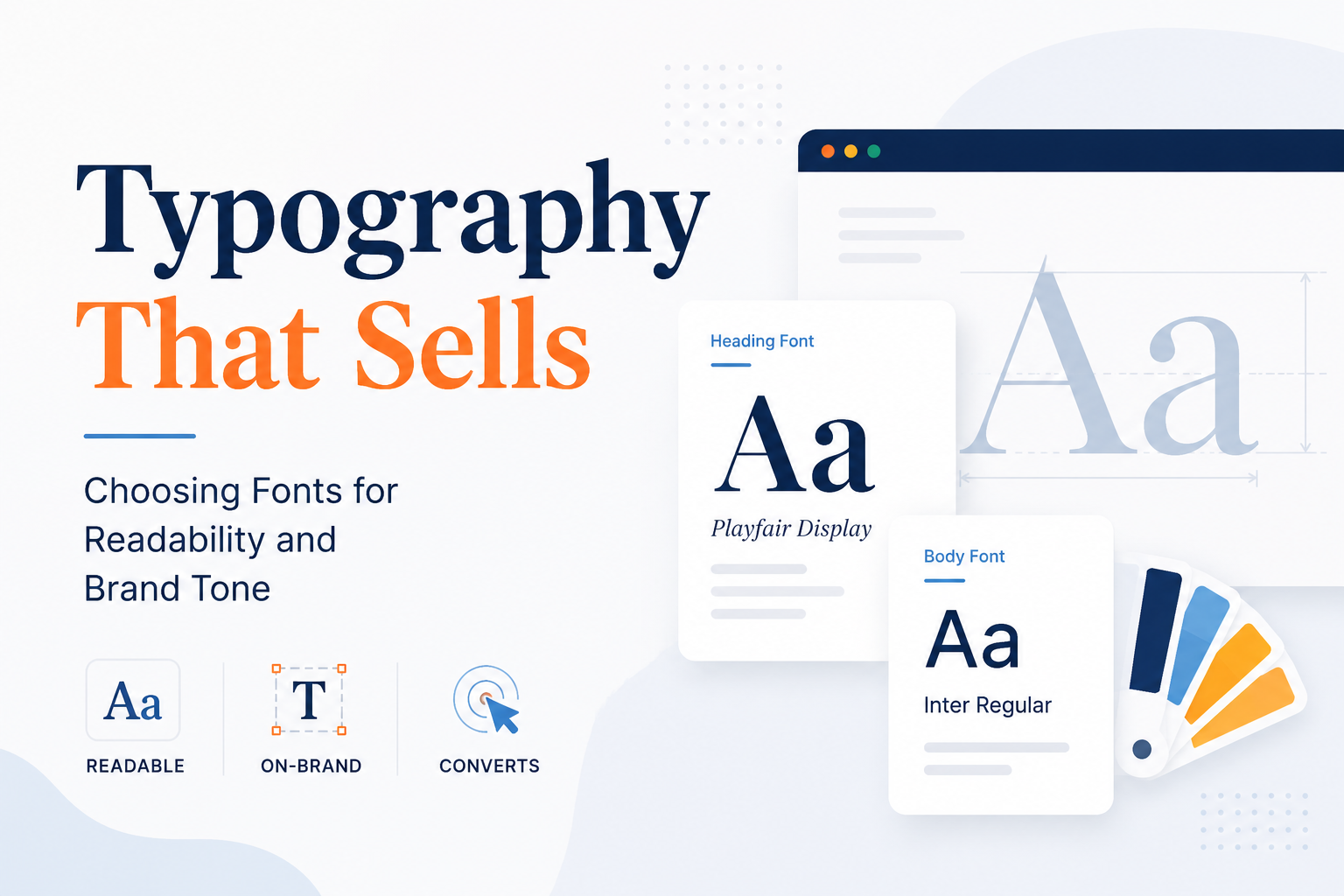
Typography That Sells: Choosing Fonts for Readability and Brand Tone
One of the first things people notice about a brand is its logo. Colors usually follow. Fonts can be skipped easily. That is not a problem. Good typography stays subtle. It sets a perception of a brand in your mind before you even have read a syllable.
Now the question arises: Why is typography important to branding? Fonts carry mood. A solid and blocky font conveys confidence. The light and airy font gives a modern, airy feel. A curly font gives you a welcoming feeling. These cues permeate your audience, even if they cannot articulate why.
Fonts Tell a Story Before Words Do
Imagine walking into a bakery. The sign uses a soft, handwritten script. You feel welcome right away. Now picture that bakery with a cold and robotic font on the sign. It feels off. That is font psychology at work. The font is processed first. The words come after.
Your brand typography sends a signal. It tells people who you are before they reach your headline or your pitch. Tone, feel, and vibe can be carried by letters alone. Most people will not notice it on purpose. The effect will still be there.
Readability Matters More Than You’d Guess
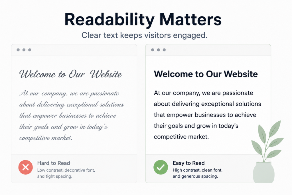
A font can look great on a mood board and still fail on a real webpage. That is why readability matters most. If your visitors have to squint to read, they leave. Full stop.
A few tips to keep your website typography easy to read:
- Keep body text at a comfortable and generous size on screens
- Avoid decorative fonts for long blocks of text
- Use a strong contrast between text color and background
- Give lines enough space so text feels open and easy to follow
- Stick to two or three fonts max to avoid visual clutter
Sans-serif fonts like Open Sans or Inter are a strong choice for websites. They are clean and easy to scan. Serif fonts like Georgia or Playfair Display add a classic and editorial feel. Both can fit. Your brand tone and your audience should guide the pick.
Choosing Fonts That Fit Your Brand
Brand typography often goes past a single font. Most brands rely on a font pairing. One font is chosen for headlines. One font is chosen for body text. The headline font draws your eye like a sign on a shop door. The body font then guides you through the details.
A strong font pairing follows one clear rule. Contrast without clash. You might use a bold serif headline. Then you can add a clean sans-serif body. Or you can set headlines in a geometric sans. Then you can write the copy in a softer humanist sans. The fonts should feel like close cousins and not twins.
Some of the best fonts for branding include:
- Playfair Display for luxury or editorial brands
- Montserrat for modern, clean looks
- Lato for friendly, approachable brands
- Merriweather for content-heavy or editorial sites
- Futura for bold, design-forward brands
Stay Consistent
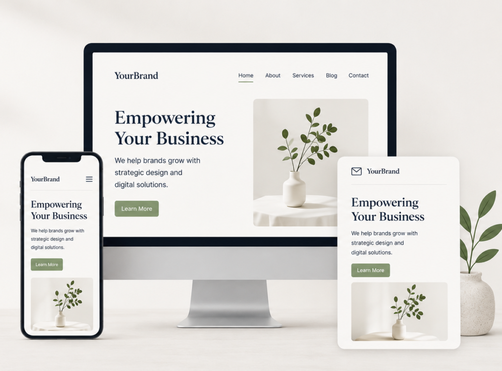
Pick your fonts. Then stick with them. Consistent typography creates a familiar feel wherever your brand shows up. When someone sees your brand in a blog post, an email, and a social graphic, it all should feel like it came from the same source.
That visual consistency builds trust over time. People start to recognize your brand without even spotting the logo. That’s a quiet kind of power that really adds up.
Typography and Conversions
Conversely, your typography will also have a landmark influence over the design of your conversion-focused element. Legible, clean fonts guide your reader along the page. They point, reduce friction, and help you find your way to the call to action. Choose the wrong font, and it does just the opposite. They confuse and repel people.
Typography and user experience design are made for each other. With every font choice, you either improve or detract from your visitors’ experience on your site.
The Big Takeaway
Typography design dictates how your brand feels for those who matter. The right fonts improve readability, reinforce your brand voice, and speak to your readers without making noise. Nail your font choices, and your visual branding comes together like a dream.