
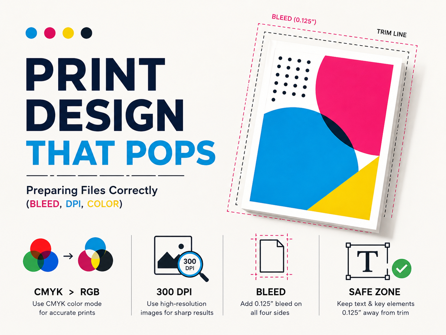
Print Design That Pops: Preparing Files Correctly (Bleed, DPI, Color)
Designs that look beautiful on screen don’t always need to look great when printed. Terrible things can happen when you are printing. There could be issues such as poor border quality, blurrier-than-ever images, and muted colors. There’s nothing worse than being excited about a design and then being disappointed when the physical copies arrive.
While unfortunate, these moments are very common. However, there are ways to make sure they don’t happen again, and new first-time printing mistakes can be avoided.
Color Mode: CMYK vs RGB
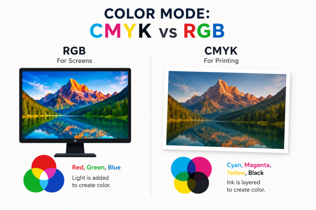
Your screen uses RGB to show color. Red, green, and blue light mix together to create the colors you see. Printers don’t use light. They use ink.
Commercial printers mix four ink colors: cyan, magenta, yellow, and black. That’s CMYK. If you send a file in RGB, the printer has to convert it. That conversion can shift your colors in ugly, unexpected ways. Set your document to CMYK before you start. Changing it at the end can throw off your whole color palette.
When You Need a Spot Color
Sometimes CMYK just can’t hit a very exact color. Coca-Cola’s red and John Deere’s green are good examples. For these, printers use a spot color. It’s pre-mixed ink that hits the exact same shade every time.
The Pantone system is the most common choice for spot colors. Metallic inks and neons also need to run as spot colors. They do cost more because each one needs its own printing plate. So use a spot color only when you truly need that exact match.
DPI: The Resolution Rule
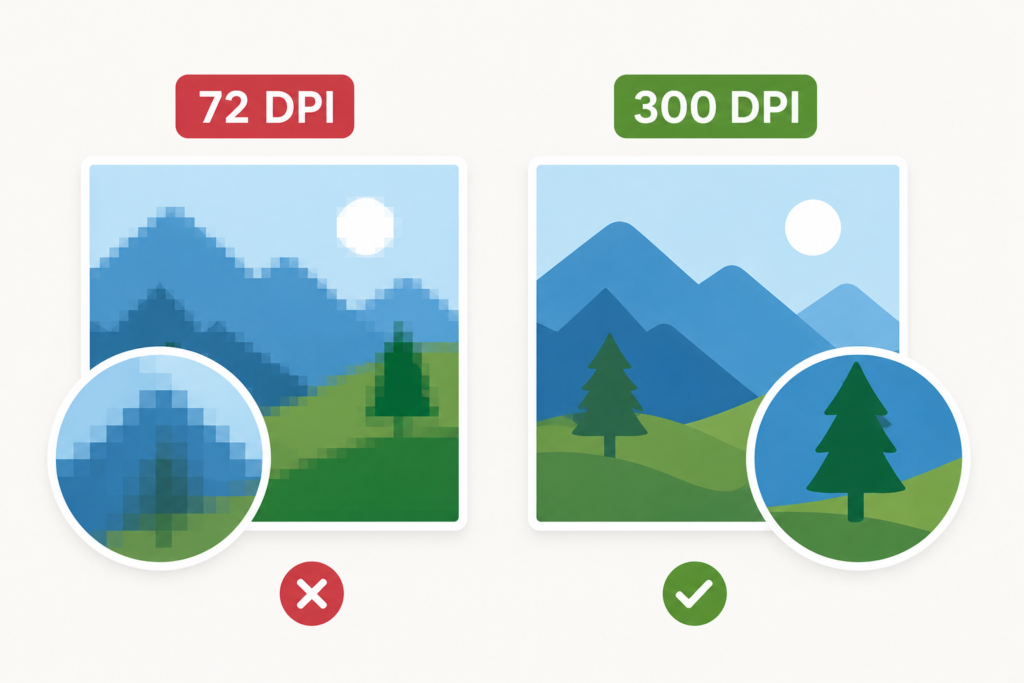
DPI means dots per inch. It controls how sharp your printed images look. For print, you need at least 300 DPI.
Most images you grab from websites are only 72 DPI. They look fine on screen, but print out soft and blurry. Check every image in your file before you send it off. If an image is low resolution, don’t scale it up. That only makes the blur worse. Start with high-resolution images from the beginning.
Bleed: Don’t Skip This
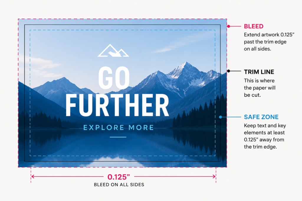
Bleed trips up almost every new designer. Here’s why it matters: printers cut paper after printing. Cuts have a tiny margin of error. If your artwork stops right at the trim edge, that small shift can leave a thin white gap around your design. It looks bad.
Bleed fixes this. It extends your artwork 0.125 inches past the trim edge on all four sides. Even if the cut shifts slightly, no white gap shows up. Set your bleed in your document settings before you start designing. Not at the end.
The Safe Zone Matters Too
Keep text and key visuals away from the trim edge. Give them at least 0.125 inches of space from the cut line. Anything too close to the edge risks getting chopped off. The safe zone protects what matters.
How to Export Your File
When you export to PDF for your printer, keep these things in mind:
- Set all images to 300 DPI or higher
- Use CMYK color mode
- Turn on document bleed settings
- Skip password protection unless your printer asks
- Use vector files for logos, text, and line art
Vector files scale to any size without losing quality. Logos, especially, should always be in vector format. A blurry logo on a printed piece is tough to recover from.
Set It Up Right From the Start
Good habits will definitely make print prep easier. Always start by choosing your color mode. Set your bleed guides in your document before laying anything out. Check image resolution. By the time you hit export, your file is ready for the printer.